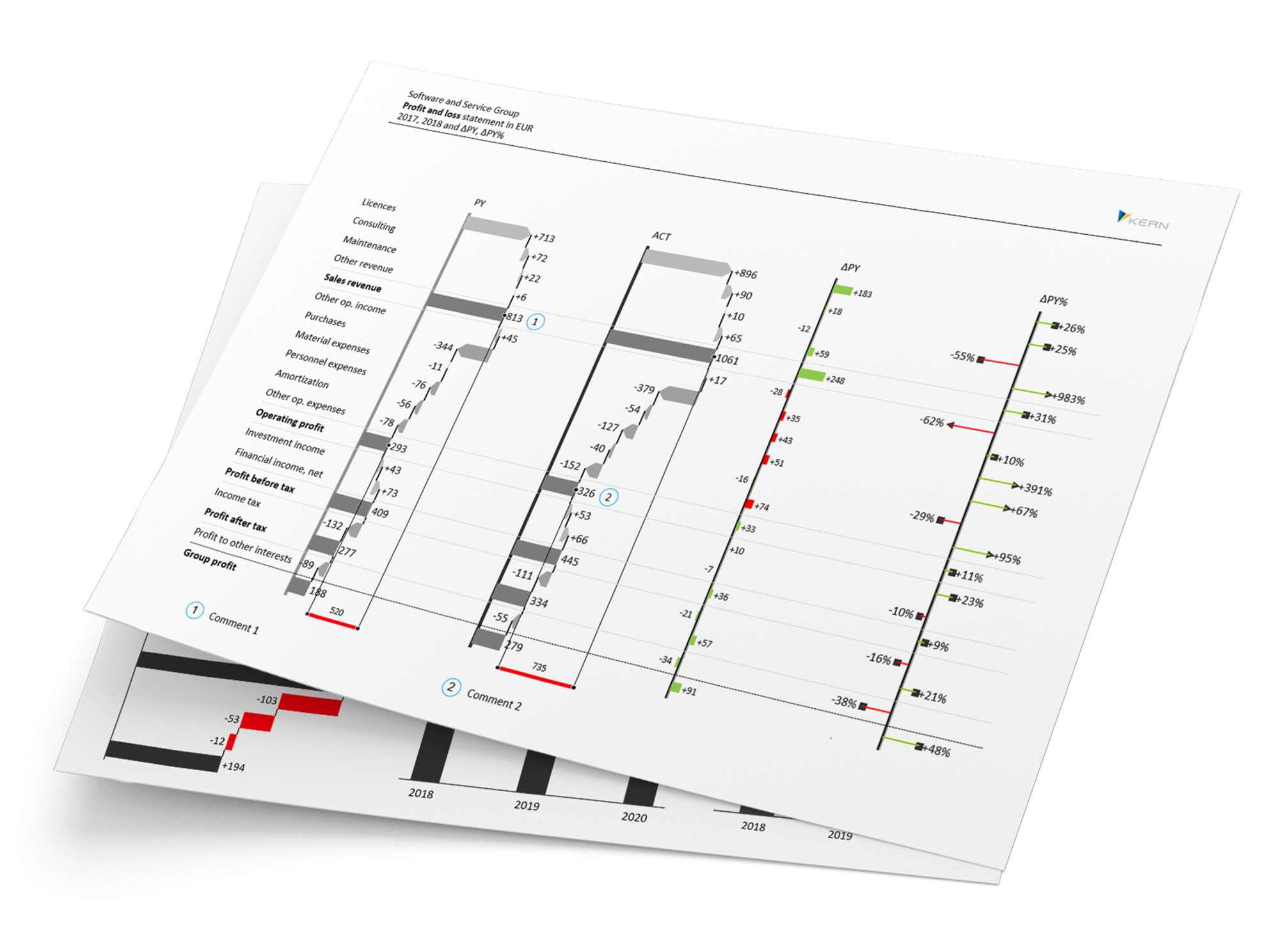
Excel Charts with Sparks
Smarter Reporting. Sharper Insights – All in Microsoft Excel
Turn your Excel reports into polished, professional presentations – without the hassle.
Sparks is the smart Excel add-in that blends powerful calculation features with intuitive reporting tools. Easily create consistent layouts, beautiful charts, and dynamic dashboards – all within your familiar Excel environment.

Excel Add-In for Dynamic Reports
Auto-adjusted charts that follow IBCS or your custom design standards
Sparks automatically transforms your Excel data into precise, dynamic charts – updating in real time with every data change. Whether you follow IBCS standards or use your own templates, Sparks ensures consistent, professional reporting every time.
- Clarity that speaks volumes: Create reports that are easy to read and built for impact – with structures, colors, and content aligned to a clear logic.
- Design that fits your brand: Fully customizable to your corporate design – all style settings are flexible, reusable, and made to match your look.
- Truly dynamic reporting: Your charts respond instantly to data changes, powered by cell references and full Excel formula support.
IBCS-Compliant
Create reports that follow the International Business Communication Standards (IBCS) – for clear, structured, and decision-ready communication.
Fully Flexible
Apply your own corporate branding and build fully dynamic reports directly in Microsoft Excel – tailored, reusable, and on-brand.
Always Consistent
Visualize reliable figures with speed and style – for reporting that’s not only accurate, but also consistently compelling.
Analyze & Visualize with Precision
Reporting
Create dynamic reports with Sparks that automatically adapt to changing values or layouts. For example, use Excel’s list selection to let users choose what they want to see directly in the dashboard.
Dashboards
Design clear, easy-to-navigate dashboards with Sparks. Overlay multiple charts in a single area—no matter how many data sources you’re using. Need your visuals to scale correctly? Simply apply familiar Excel formulas like MAX() to keep everything perfectly aligned, no matter the changes.
Excel & PowerPoint
Finished Excel charts can be transferred to PowerPoint in an instant via copy & paste. Since Sparks uses only native Microsoft Office shapes, the graphics scale automatically—ensuring crisp, sharp visuals without pixelation.
Charts & Tutorials
From column and bar charts to detailed comparisons—Sparks offers a wide variety of chart types for clear data visualization. Discover how easy it is to create professional, well-structured reports. In the tutorial and explanatory videos on our YouTube channel, we present them to you step by step.

Data Analysis in SAP
Sparks is the only Excel add-in that lets you view dynamic reports directly within your SAP system. Combined with Allevo Junan, the controlling tool that ensures seamless integration between SAP and Excel, Sparks takes your internal controlling and reporting to the next level.
Prices
Not sure if Sparks is right for you? No worries — you can try our reporting tool for free anytime..
Ready to take the next step? Send us a message, and we’ll create a personalized quote tailored to your needs for purchasing a Sparks license.
Free
- 60-day access
- Full-featured version at no cost
- Includes support and consultation
Corporate
- Unlimited duration
- Starting at €475/user (plus VAT)
- Includes maintenance & support
System Requirements:
- Windows 7 or later (32-bit or 64-bit)
- Excel 2007 or later (32-bit or 64-bit)


